I had a simple concept for the art on Just a Whim. From the beginning, I knew what I wanted, and I even thought I knew how to get it. I was definitely wrong about that.
The cover needed only a few things, a hand and some ribbons. Why ribbons? Why a hand? I thought both of them symbolized what the story was largely about. Whim’s ability to see these things that pass through our thoughts and hands sometimes faster than we notice. The dreams, the hopes, the wishes, and the fear, all kind of like threads passing by. Then we have his mother who gave him rules, and these rules could be chains, but Thyme points out that they could be more like guidelines, that they only really matter when Whim believes in them, and so in a way, the cover is also showing those rules falling away.
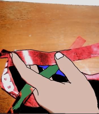
At least, that was the theory. The execution of it… Well, it definitely didn’t look good when I started in on it. I figured all I needed was a picture of my hand with some ribbons. Then the color was wrong, so I started to fix that.

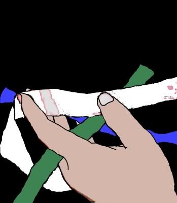
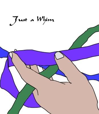
You can see it wasn’t going quite as I hoped. Still, I kept trying. I got rid of the background, made it so that the ribbons were all solid color, and the hand even looked… okay.

It was coming along. Really. Okay, kind of.

I thought making it white in back would help.

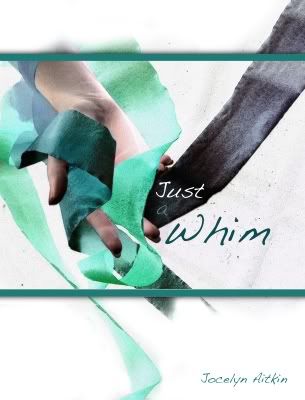
Still, I could tell it was wrong. I asked for help. This is what I got. This is why I need a cover artist. Because the cover artist did this.

It’s still my hand, though.

