So I have a bit of a dilemma, a conundrum, a debate with myself.
A long time ago, I thought that I had picked out a perfect divider art for the entire Nickel and Dime series.
It was such a simple concept, and the graphics side of Kabobbles took the concept and made a picture. I thought it was what I wanted, but as soon as I tried to use it in the file, I changed my mind.
I don’t know that a nickel and a dime really fits the story. It’s got a connection: Effie’s store is named Nickel and Dime. Her family’s name was Nickell. There’s a few lines about nickels and dimes. There is even a character named Tennant.
It’s just… I don’t think it’s right.
The graphic artist said she would change it from this:
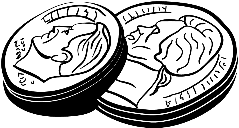
to this:
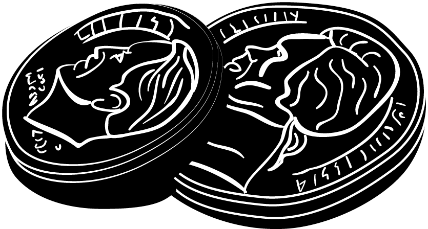
and that should help.
I don’t know. I still don’t know that I want it as the divider. Bear in mind that they would be a lot smaller in the book. I’m just including the big versions for comparison and best quality as I try and get some thoughts from others.
Is the writer being irrational?