Historical Divider Art

Being able to be a volunteer at the local museum has been a rather beneficial thing for me (I’m not so sure I was as helpful to them, even as much as I tried to do my best to transcribe the letters as quickly and accurately as I could.) I have been able to experience many things, learn about different historical events and skills and ways of life.

At the orientation, I wandered around and took pictures of some of the buildings, including this one:

school

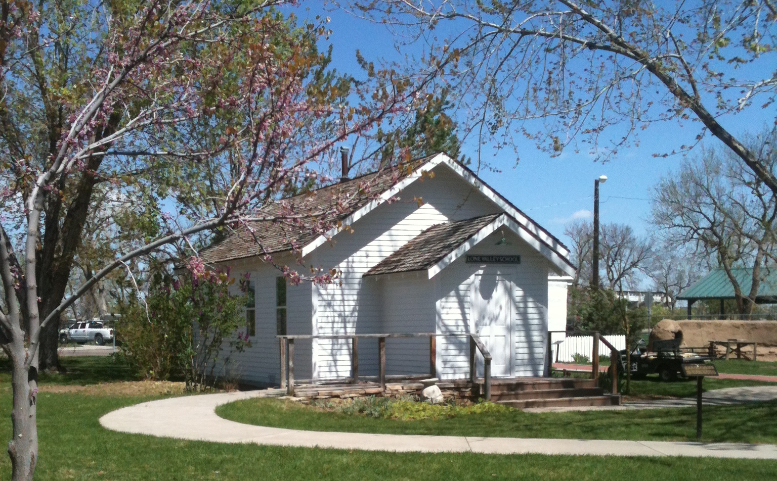
That picture enabled the artist to create the divider art for the two historical novels I’ve written featuring Tillie, a teacher. She had to have her school.

divider art school house cs5 rev 1

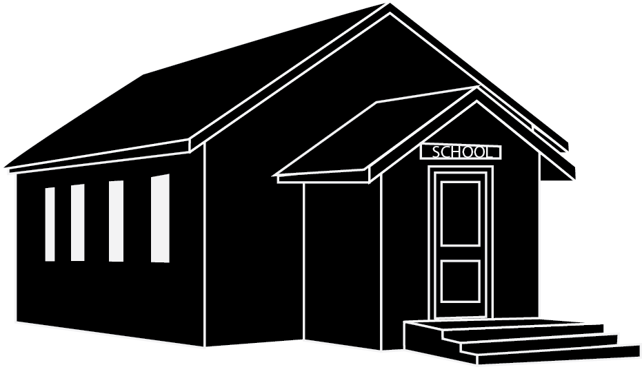
Upon reconsidering, we knew that the school needed a chimney, but a chimney expert told us the chimney in our reference picture was not right for the time period that I’d set the story in, so this one was added, and this is the end result:

divider art school house cs5 rev 2

It will be a lot smaller in the book, since it will be used to divide scenes/chapters, but it is a beautiful piece of work, isn’t it?

An Art Related Dilema

So I have a bit of a dilemma, a conundrum, a debate with myself.

A long time ago, I thought that I had picked out a perfect divider art for the entire Nickel and Dime series.

It was such a simple concept, and the graphics side of Kabobbles took the concept and made a picture. I thought it was what I wanted, but as soon as I tried to use it in the file, I changed my mind.

I don’t know that a nickel and a dime really fits the story. It’s got a connection: Effie’s store is named Nickel and Dime. Her family’s name was Nickell. There’s a few lines about nickels and dimes. There is even a character named Tennant.

It’s just… I don’t think it’s right.

The graphic artist said she would change it from this:

divider for nickel and dime

to this:

divider for nickel and dime rev 1

and that should help.

I don’t know. I still don’t know that I want it as the divider. Bear in mind that they would be a lot smaller in the book. I’m just including the big versions for comparison and best quality as I try and get some thoughts from others.

Is the writer being irrational?

Hello, Katya

One of the things that we at Kabobbles like to offer as a part of our ebook experience is divider art. It enhances the reading of the story not just in having a pretty picture, but as some ereaders do not seem to keep spacing between scenes and chapters like they should, art makes a nice differentiation between the scenes.


Well, yesterday, the design half of Kabobbles made an absolutely wonderful divider art for The Consultant and the Cat, one almost too good just to be divider art.


Therefore, it must be shared.


leopard divider art